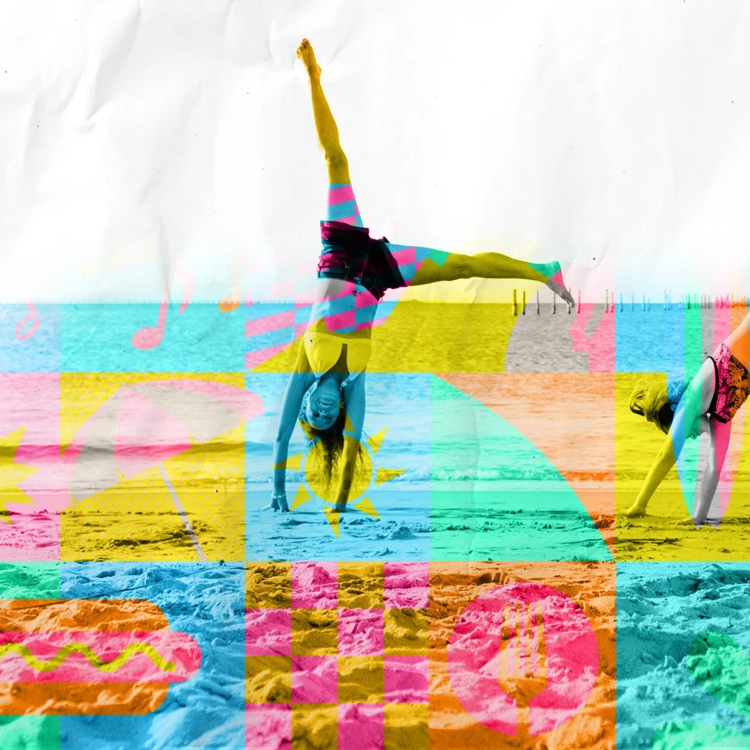
This campaign concept, developed in response to the St. Pete–Clearwater RFP, was grounded in key research insights: while visitors are initially drawn by the area’s renowned beaches, they often leave with a deeper appreciation for everything else the destination offers.
The creative direction reflects this journey always leading with the beaches, the primary draw, but quickly revealing a vibrant array of experiences that go far beyond the shoreline. From arts and culture to culinary gems and local charm, the campaign invites travelers to uncover the emotional richness and diverse activities that define the true spirit of St. Pete–Clearwater.
It’s not just about what you do, it’s about how it makes you feel. This concept captures that emotional connection, positioning the destination as both a relaxing escape and an inspiring place of discovery.
Materials include:
Print
Digital
OOH
Moodboard
Design 1: This design communicates professional-grade quality through a sleek, modern aesthetic. Deep blue and charcoal tones project confidence and depth, while refined wood-grain accents on the cap introduce a layer of sophistication. A subtle “V” motif echoes the lines of a collared shirt, nodding to the ritual of getting ready each day. Finished in high-gloss, the packaging exudes a polished, premium look mirroring the style and confidence of the man who uses it.
Design 2: Plaid accents and a bold, no-nonsense aesthetic give this design a rugged, Braveheart-inspired edge in the grooming aisle. Feeling authentic without feeling overdone. Each product line, (beard care, shaving, skincare) is distinguished by its own plaid colorway, creating intuitive navigation and strong shelf impact. A transparent cap reveals the inner mechanics of the dispenser, adding a tool-like, utility-driven quality that feels as functional as it is masculine.
What better way to launch Yamaha’s most powerful outboard yet than to compare it to something else that launches from Cape Canaveral? The bold, unexpected visual delivers instant stopping power—inviting a double take with its clever twist: Is that a rocket… or a boat?
This creative concept taps into visual surprise to showcase the raw thrust of the XTO Offshore. At first glance, it mimics a rocket launch. But look closer, and you’ll discover it’s a boat powered by an outboard engine that redefines what’s possible on the water.
The comparison is more than clever, it’s accurate. The XTO Offshore delivers force and reliability that pushes boundaries, taking boaters further and bringing them back with Yamaha’s legendary dependability. As boats continue to grow in size and ambition, Yamaha’s XTO matches that evolution with power to explore uncharted waters.
This visual doesn’t just promote a product, it captures a mindset: bold exploration, next-level performance, and the thrill of going where others can’t.
This standout creative was featured on Ads of the World, garnering over 10,000+ views, and was honored with a MarCom Gold Award in 2020.
In Montana, there’s always a new adventure just around the bend. “The Adventure Continues” captures the spirit of a place where every moment invites discovery—whether you're chasing adrenaline, serenity, or something in between.
This campaign positions Montana as the perfect destination to travel again, especially for travelers emerging into a post-COVID world. It’s an open invitation to reconnect with the outdoors, with others, and with yourself. By showcasing a wide range of experiences and seamlessly integrating multiple brand pillars, the message is both inclusive and inspiring.
At its core, the campaign bridges familiarity and curiosity. For those unfamiliar with Montana, it reveals the breadth and beauty of the state’s diverse tourism regions and partners. For seasoned travelers, it promises more to uncover.
Just as important, the campaign meets the client’s goals of visitor dispersal, encouraging travel to lesser-known corners of the state in support of sustainable tourism. The TV spots enhance this message through a series of striking match cuts, smoothly transitioning between adventures. Giving viewers a sense of flow, possibility, and visual elegance without ever feeling fragmented.
Montana isn’t just a place you visit, it’s a place that calls you back. Because in Montana, the adventure never really ends—it just changes shape.
TV: The Green Bay Packers scratch tickets offered an amazing top prize: a Lambeau Field suite for the winner and 24 of their closest family and friends. The TV spot imagined how a potential winner (Kevin) might go about drafting their top 24 suite mates, just like the NFL draft.
Print: Featuring the main secondary talent from the TV, Steverino and Nana Mary were big characters to highlight in print. The ads reinforce that anyone can win or anyone you know can win so play nice!
Outdoor: A social campaign, #DraftYourPack, encouraged people to share who they would invite to their Lambeau Field suite. Uploaded photos were featured on Lottery outdoor boards throughout the state of Wisconsin.
“Happiness Is...” invites each traveler to define joy on their own terms. It’s a celebration of individuality and an open-ended phrase that becomes deeply personal. Whether it’s catching your first wave, wandering through a vibrant mural-lined street, or simply unwinding with loved ones by the ocean, Virginia Beach becomes the backdrop for your own version of happiness.
This evolved campaign connects with a broader audience by embracing the full spectrum of experiences the destination offers. From adventure seekers to art lovers to families looking for ease and comfort, “Happiness Is...” reflects the emotional and experiential diversity found in Virginia Beach.
Because happiness isn't one-size-fits-all.
Travel is all about moments and sharing them, whether with loved ones or your social media followers. Montana is no exception. To make capturing and sharing those experiences even more fun, we created a custom series of GIF stickers for Visit Montana, designed specifically for Instagram Stories.
These playful, travel-inspired stickers gave visitors an easy, creative way to express their Montana adventures, from moment they landed in Montana to epic hikes to cozy campfires. Available throughout the visitor journey, they helped boost social engagement and familiarize travelers with everything the state has to offer.
The results? Over 5.1 million uses and counting.
Small stickers. Huge impact.
What if Alaska were a person? Able to take you by the hand and guide you into wild wonder? Whisper in your ear of secrets waiting to be discovered? Speaking not only with awe and reverence, but also with the fierce pride of a land unlike any other?
“I am Alaska” gives Alaska a voice that match its’ soul. It’s not just a slogan, it’s Alaska personified. Speaking in first person, it shifts effortlessly between quiet reflection and unapologetic strength. This campaign doesn’t just tell you about Alaska, it makes you feel Alaska. Evocative, compelling, and deeply human.
Authentic in tone, “I am Alaska” invites engagement. It adapts whether speaking to regional heritage, illuminating unique experiences, or challenging outdated assumptions about accessibility. It’s a flexible voice grounded in truth.
This is not messaging that lectures.
It’s a conversation. A welcome. A presence.
It is Alaska—speaking for itself.
Rooted at the shoreline and radiating outward across Sarasota County, our brand strategy harnesses the easygoing, revitalizing energy that defines the destination. It's that irresistible feeling, both serene and exhilarating, that captures the essence of daily life here and keeps visitors coming back.
The “Splash” campaign beautifully translates this spirit through a bold visual direction featuring stylized waves and bursts of vibrant color. A celebration of our coastal lifestyle brought to life and full of energy.
This lively and expressive concept thrives on dynamic visual effects that mirror the joy, excitement, and contentment felt by residents and travelers alike. Through a mix of existing imagery and newly developed assets, we enrich every moment, making them more vivid and emotionally resonant. Think fluid animated GIFs, motion-driven video elements, and design that moves as effortlessly as the tides.
Distinctive and ownable, Splash positions VSC for next-level brand differentiation. Creating a visual identity that not only reflects the destination but sets it apart for years to come.
No matter how long you’ve been gone, now is the time to bring your heart and your career, back to Montana.
This campaign from the Montana Department of Commerce invites you to rediscover what it means to live under the big sky. With major investments in broadband infrastructure, working remotely from one of Montana’s welcoming, community-driven towns is more possible than ever.
It’s more than a move, it’s a return to something deeply personal. A reminder of what it feels like to breathe easier, live slower, and truly connect. Whether you grew up here or simply long for something more grounded, this initiative is about coming home to a place that never really left you.
Live where your heart feels full. Work where you feel free. Montana is calling.
Over the years, I’ve had the opportunity to create logos, brand identities, and visual systems for a diverse range of clients across multiple industries. Here are just a few of my personal favorites.
Tucked along Florida’s Gulf Coast, Crystal River is a truly one-of-a-kind destination and the Manatee Capital of the World, where hundreds of gentle manatees gather in the serene, spring-fed waters each year. Here, the warm saltwater of the Gulf merges with crystal-clear rivers and natural springs beneath a canopy of moss-draped cypress, palms, and blooming magnolias, creating a setting that feels both tranquil and timeless.
Surrounding towns like Floral City, Homosassa, and Inverness offer a glimpse into Florida’s charming coastal past, with laid-back attitudes and old-school character that welcome visitors with open arms. These communities, nestled within Citrus County, invite exploration and reflection. A true step back in time with all the magic of the present moment.
The campaign’s greatest challenge and opportunity was balancing the signature, immersive water experiences like swimming with manatees and scallop diving, with the vibrant stories unfolding above the surface. From scenic bike rides and wildlife encounters to small-town charm and local eats, Citrus County offers exhilaration in equal measure on land and water.
This is more than a getaway. It’s a place to reconnect, recharge, and rediscover the wild heart of Florida. Unfiltered, unforgettable, and unlike anywhere else.
Proud recipient of the 2024 IAC Award for “Outstanding Integrated Advertising Campaign”.
Materials include:
-Print
-Animated Rich Media Take Over
-Digital
Cantaro Tequila
To break away from the traditional, heritage-heavy look common in the tequila aisle, the client sought a bold, contemporary design that would speak to a younger, style-savvy audience. The result is a striking geometric label inspired by Aztec patterns. Modernized to command attention on the shelf. With its vivid lines and energetic rhythm, the design feels festive and vibrant. Perfect for catching the eye of partygoers scanning the liquor store for their next standout bottle.
Sendero Tequila
The creative direction for Sendero embraced a refined, heritage-inspired approach. Striking a careful balance between tradition and modern sophistication. The design channels a classic, timeless aesthetic, crafted to elevate the purity and brilliance of the silver tequila.
A key challenge was showcasing the clarity of the spirit itself. This was solved through an innovative use of layered label design featuring complementary graphics on both the front and reverse side of the bottle. This creates a sense of depth and dimension, drawing the eye through the crystal-clear liquid and emphasizing the pristine quality of the tequila.
The result is a design that feels both authentic and elevated. Honoring Sendero’s historical roots while delivering a distinctive, premium shelf presence.
"Get Estes Inspired" was more than just a tourism campaign, it was a movement designed to promote sustainable travel and visitor education in and around Estes Park. With Rocky Mountain National Park facing the challenges of over-visitation, and the local community eager to attract visitors who tread lightly, the campaign focused on a shared goal of protecting what makes the destination so special.
At the heart of the solution was community involvement. Locals were positioned as the heroes of the campaign, featured prominently in visual storytelling and given a platform to share messages about responsible travel and stewardship. By putting residents at the forefront and sharing park experiences that live within them, the campaign fostered authenticity and local pride while helping visitors understand their role in preserving the environment.
The “Get Estes Inspired” concept also extended to social media, encouraging both residents and visitors to share personal stories, stunning visuals, and meaningful insights about their connection to Estes Park. This created a ripple effect inspiring a respectful, like-minded audience to engage with the destination in a way that honors its natural beauty and community values.
Ultimately, the campaign helped build a shared culture of appreciation, responsibility, and love for nature. Uniting visitors and locals alike in the mission to keep Estes Park wild, beautiful, and welcoming for generations to come.
This simple and beautiful poster printed on textured canvas, intrigues and features the full-line of engine oils offered by Yamalube in an unique, revealing visual with stopping power.
Copy: SUDDENLY, RIDING FEELS
LIKE FLYING.
Yamalube engine oils evolve your riding experience—whether you’re soaring the open road, hightailing a mountain trail or catching air off a double. Our specific formulas enhance the performance of your Yamaha engine with unmatched quality. Learn more at Yamalube.com.
Awarded in 2018, the Adworkers’ Milw99 Merit Award.
What sets Wisconsin apart from every other destination isn’t just the scenery, it’s the way it feels like home. The Badger State welcomes you with open arms, offering a spirited, inclusive culture that invites visitors to truly let go, be themselves, and make lasting memories with family, friends, and unforgettable food.
From backyard celebrations to bustling festivals, every experience in Wisconsin is grounded in a shared joy and a sense of belonging. Here, there's no pressure, no pretense, no attitude, rather an unshakable commitment to good times and genuine connection. Whether you’re reconnecting with loved ones or discovering new traditions, Wisconsin welcomes you with open arms.
The "Welcome to the Family" brand platform also taps into one of the most powerful trends in travel today: foodie-driven exploration. Across the state, travelers are flocking to restaurants, food festivals, craft breweries, and music events that turn meals into memories.
From Ashland to Lake Geneva, Baileys Harbor to the St. Croix River, the flavors are bold, the experiences are rich, and the welcome is always warm. This campaign builds long-term brand equity by delivering on the promise that when it comes to authentic joy and meaningful connections, Wisconsin treats you like one of its own.
So go ahead, jump in, dig in, and join the family.
This out-of-home campaign served as a warm invitation for travelers to once again experience the rich cultural events held on Montana’s Indian Reservations in the post-COVID era. More than just a call to return, it was a powerful message to the world: these communities are open, welcoming, and ready to share their stories.
The campaign also achieved a key client objective of promoting visitor dispersal by encouraging exploration of less-traveled regions of the state. This supported sustainable tourism efforts, helping to alleviate pressure on more heavily visited areas while fostering deeper cultural appreciation and economic benefit in underrepresented communities.
Part of a broader statewide dispersal initiative, this work was honored with a prestigious ESTO Award, recognizing its impact, cultural sensitivity, and strategic success.
TV: One soon-to-be legend will score the ultimate bragging rights with the Wisconsin Lottery Packers Scratch Games. Instant cash prizes are just the beginning—every ticket is a shot at a bonus drawing for a legendary game day at Lambeau Field. We’re talking a private suite experience for you and 24 friends, plus transportation to make your entrance unforgettable.Packers Scratch Games. Become a legend.
Print: Carrying over the energy and star power of the TV spot, the print campaign features the same hero cast along with diverse supporting talent to connect with a wide range of audiences. With bold, playful visuals and dynamic type integration, the ads reflect both the vibrant tone of the TV commercial and the visual style of the Packers Scratch Game tickets. Results were a cohesive, high-impact successful campaign across all platforms.
What makes the Tempe experience truly unique is the captivating blend of contrasts, nature, city, cultures, and unexpected discoveries that come together in one dynamic destination. It's a place where choices abound, and where surprises feel seamless. Inviting visitors to craft journeys as diverse and vibrant as the city itself.
The "Multiplicity" campaign brings this spirit to life by celebrating the endless possibilities Tempe has to offer. Through a rich, layered visual expression of colors, textures, bold southwest graphics, and a collage of authentic scenes, the campaign reflects the artistic energy and exploratory nature of the destination.
Playful headlines and imaginative copy lean into interwoven experiences, from the adventurous to the laid-back, recognizing that every traveler has their own pace and passion. Whether you're here to dive into arts and culture, explore outdoor escapes, or savor bold flavors, Tempe welcomes you to find your rhythm and make it your own.
At its heart, this campaign is about more than just travel, it's about inspiring curiosity, meeting people where they are, and embracing the multiplicity of the human experience through the lens of a destination that thrives on creative contrast.
The objective of this project was to develop a cohesive packaging system for an entire line of aerosol lubricants, while building on an existing color-coded product grouping strategy. Each color cue reinforces product categories, allowing for quick visual navigation on the shelf.
To enhance user clarity, custom iconography was created to indicate the intended vehicle type at a glance. Paired with concise, bullet-pointed copy, the design ensures consumers can quickly and confidently select the right product for their needs.
The system strikes a balance between consistency and flexibility. Maintaining a strong, unified brand presence across the line, while accommodating each SKU’s unique regulatory and informational requirements.
TV: To get the rare and always-popular season tickets at Lambeau Field, you can get on the wait list for 20 or 30 years, or you can check out Wisconsin Lottery’s Packers Scratch games Bonus Drawing. There’s no telling what happens if you mail in your entry. Or, what happens if you mail in yourself.
Print: This playful visual twist shows just how far some fans will go for their shot at Packers greatness. What can I say, it's a real contortionist!
This catalog was packed with a high volume of detailed product information, featuring oils prominently in the front section and a wide array of chemicals in the back. One of the key challenges was developing a set of versatile master page templates capable of accommodating the client's content-rich requirements while remaining flexible across varying layouts.
The chemical section followed predefined product groupings, which meant some pages were densely packed while others had minimal content. The solution was a modular design system that maintained visual consistency while adapting seamlessly to both sparse and content-heavy layouts.
The overall design and branding from this catalog extended beyond print and serving as a cohesive visual foundation for the client’s website and point-of-purchase (POP) kits, ensuring a unified brand experience across all platforms.
Everyone loves giving the perfect holiday gift but no one loves the stress that comes with finding it. In this festive and lighthearted Wisconsin Lottery commercial, we follow a frazzled husband as he scrambles through a chaotic day of holiday errands, determined to tackle his Christmas shopping list.
Meanwhile, his wife has a much smarter plan: she’s unwinding at the spa with friends, knowing her holiday shopping is already done. Her secret? A quick stop at the local convenience store for Wisconsin Lottery Holiday Scratch Games. The perfect, easy gift that fits everyone on her list.
One stop. No stress. Big smiles. Because sometimes, the best gift is the one that’s fun to give and get.
Design 1: This poster was targeted at the younger hard-core mountain sled rider. The design reflects a youthful, dynamic and vibrant design that also includes some the accessories offered for this specific rider.
Design 2: This poster is for trail riders who are more chill and ready to cruise on groomed paths. Both riders like to customize their sleds so the POP was meant to bring awareness and show a sampling of the products offered by Yamaha.